The Problem:
The original KÜHL website felt visually outdated and made it difficult for users to quickly browse and filter products. Navigation lacked clarity, and the shopping experience wasn’t as smooth or engaging as it could be.
The Goal:
* Improve product discoverability
* Simplify navigation and filtering
* Create a clean, modern interface aligned with the brand
* Enhance the overall shopping experience
Key Contributions
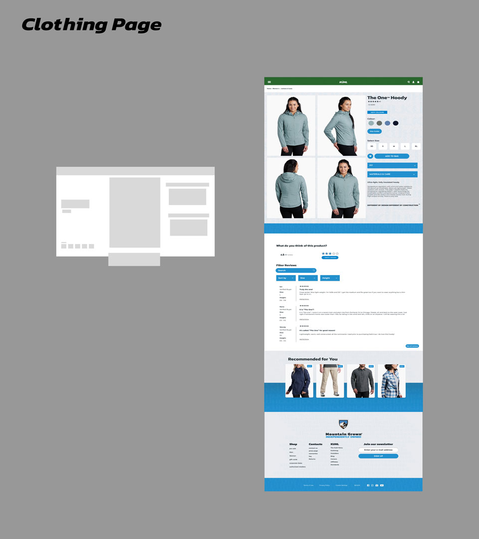
Clothing Page (My Focus)
* Designed a clear and structured product grid
* Improved filtering and sorting options for easier browsing
* Focused on visual hierarchy to highlight key product details
* Created a layout that balances functionality and aesthetics
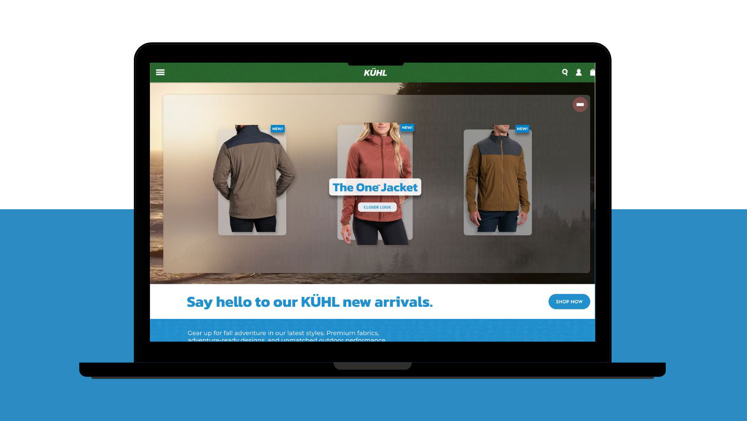
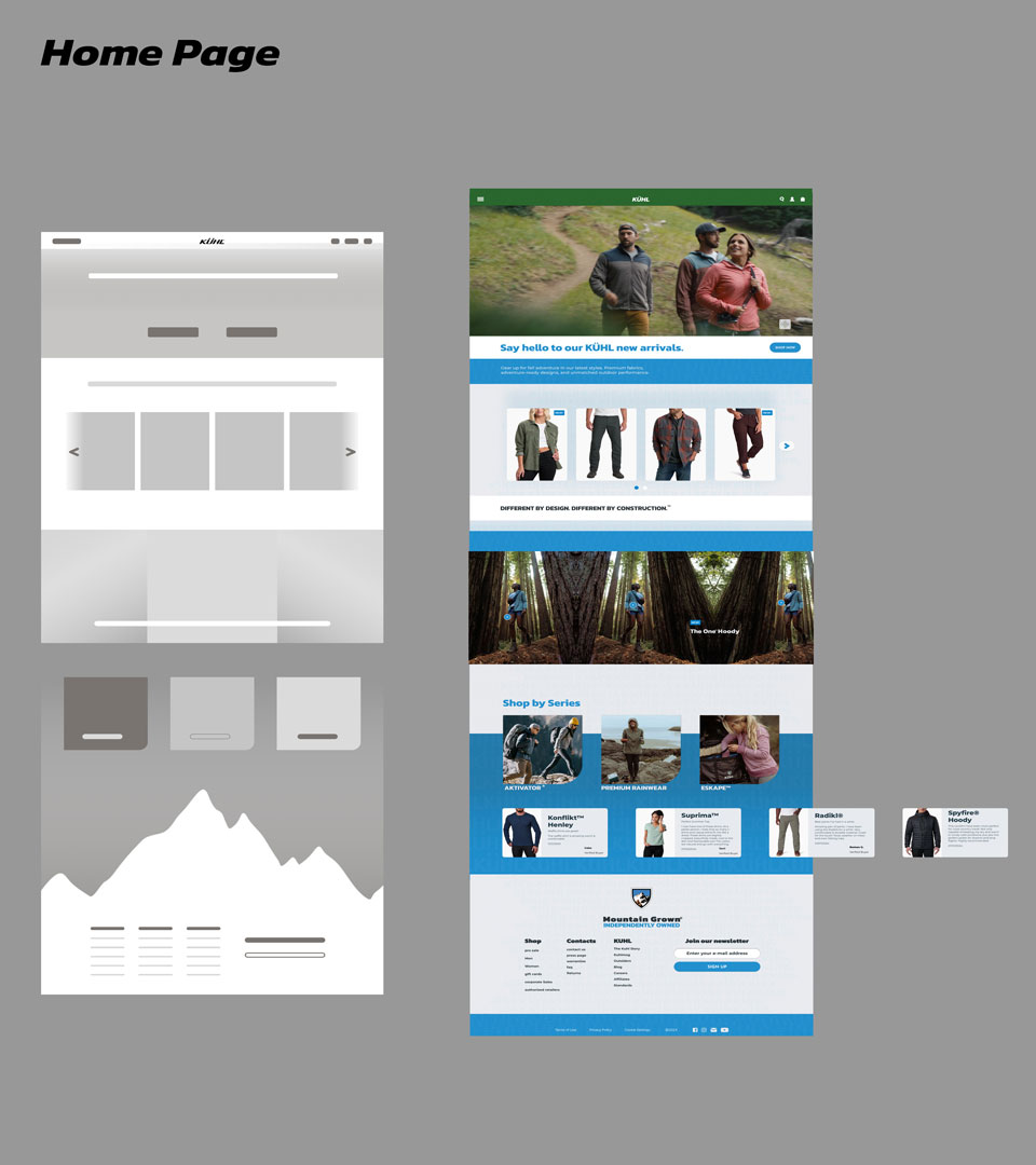
Homepage (Collaborative)
* Designed a strong hero section to showcase brand identity
* Improved navigation for quicker access to categories
* Created a more engaging and visually cohesive landing experience
Our Process:
1. Research & Analysis
We reviewed the existing website to identify usability issues and areas for improvement. We focused on navigation, layout structure, and how users browse clothing categories.
2. Wireframing
We created initial wireframes to explore layout options for the homepage and product listing pages, focusing on clarity and hierarchy.
3. UI Design
We developed a modern visual direction that reflects KÜHL’s rugged, outdoor identity while keeping the interface clean and easy to use.
4. Prototyping
We built an interactive prototype in Figma to simulate user flows and test the redesigned experience.
The Solution
The final design delivers a more intuitive and visually modern experience. Users can now easily browse products, filter options, and navigate the site with less friction. The updated design better reflects KÜHL’s brand while improving usability across key pages.
My Role
UX/UI Designer
Team
Group project (2 designers)
Timeline
3–4 weeks
Tools
Figma